Introduction
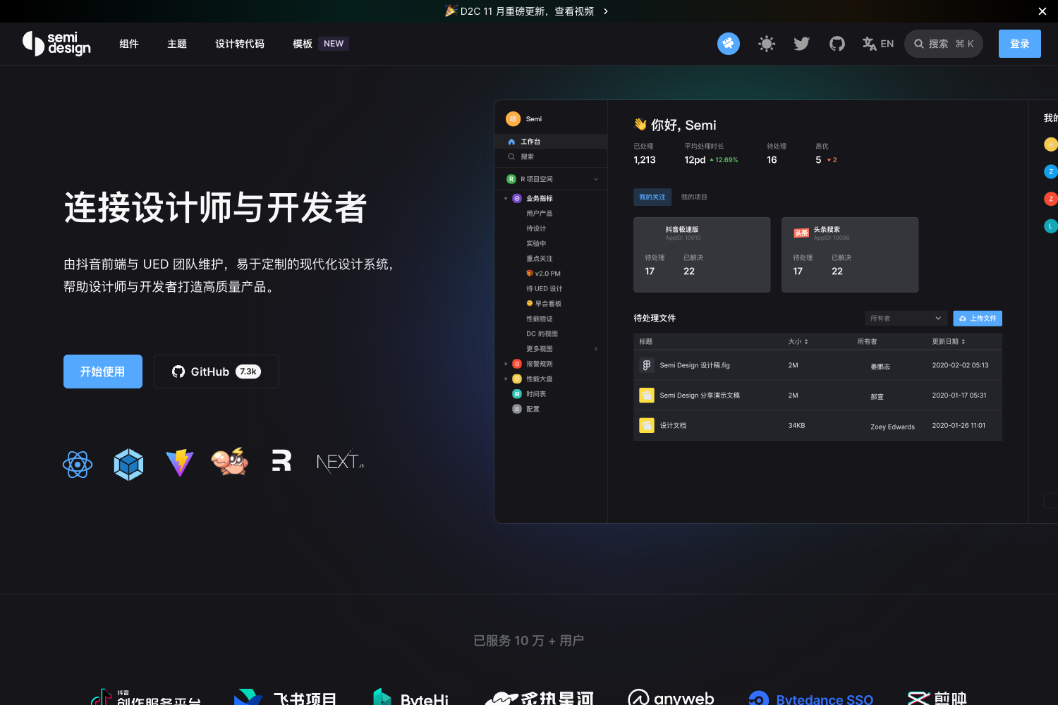
Semi Design is a modern, comprehensive, and flexible design system and React UI library. It offers over 60 high-quality components and provides more than 3000 design tokens, making it easy to build custom design systems. Semi Design stands out with its Design to Code (D2C) and Code to Design (C2D) features, allowing seamless translation between design and development.
Main Features
- 60+ high-quality React components
- Official Design to Code (D2C) support
- Code to Design (C2D) functionality
- Accessibility (A11y) support following W3C standards
- Design system management with Semi DSM
- Internationalization support for multiple languages
- Comprehensive testing including unit, E2E, and visual testing
- Written in TypeScript for better type support
- Server-Side Rendering (SSR) compatible
- Web components compatibility
Installation Steps
To install Semi Design, run the following command in your project directory:
npm install @douyinfe/semi-ui
Usage Instructions
- Import the necessary components from Semi Design:
import React from 'react';
import { createRoot } from 'react-dom/client';
import { Button, Form } from '@douyinfe/semi-ui';
- Use the components in your React application:
const App = () => (
  <Form>
    <Form.Input field='name' initValue='semi design' />
    <Button htmlType='submit'>submit</Button>
  </Form>
);

const root = createRoot(document.querySelector('#app'));
root.render(<App />);
For Design to Code functionality:
- Install the Semi Figma Plugin
- Use the plugin to translate Figma designs to code
- Output formats include JSX + SCSS, Emotion, Tailwind, or JSON Schema DSL
For Design System Management:
- Use Semi DSM to define your design system based on Semi UI
- Configure over 2700 tokens to customize every detail
- Sync between Figma and code in real-time
Important Notes
Semi Design supports all major modern browsers, including the latest two versions of Chrome, Firefox, Safari, Edge, and Electron.
The project is actively maintained, with regular updates since 2019.
Semi Design follows accessibility guidelines, providing keyboard interaction, focus management, and ARIA support for all components.
The library is written in TypeScript, offering strong type support for developers.
Server-Side Rendering (SSR) is supported out of the box.
Semi Design is compatible with web components, making it suitable for building SDKs and browser plugins.
The project uses a Foundation/Adapter architecture, making it easier to read and contribute to the codebase.
Extensive documentation is available, including guides for quick start, component overviews, theme customization, and more.
The project is open-source and welcomes contributions. Refer to the CONTRIBUTING documentation for guidelines.
Semi Design is released under the MIT License, allowing for flexible use in various projects.


