Introduction
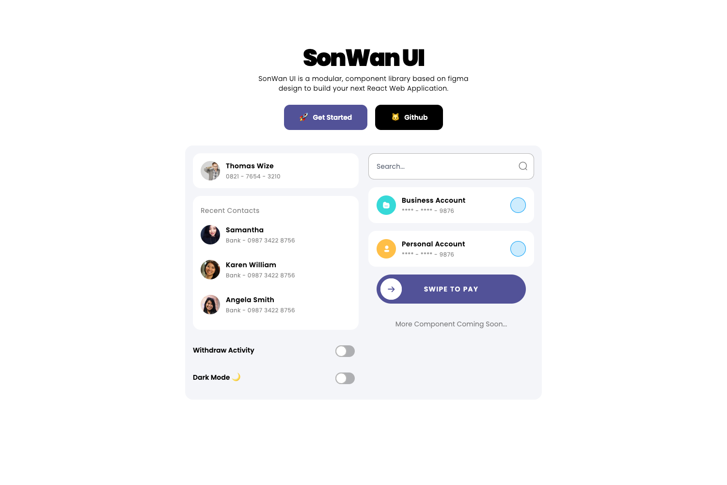
SonWan UI is a modular UI component library designed for building React web applications. It's based on Figma designs and offers a collection of pre-built, customizable components. This library aims to streamline the development process by providing ready-to-use UI elements that are both visually appealing and functional.
Main Features
- React-based components for rapid UI development
- Figma-inspired design for consistent and modern aesthetics
- Modular architecture allowing easy integration and customization
- Tailwind CSS integration for flexible styling
- Responsive components suitable for various screen sizes
- TypeScript support for improved development experience
- Minimal dependencies for lighter application builds
- React Native support through a separate package
Installation Steps
Navigate to your React project directory.
Install SonWan UI using npm or yarn:
npm i sonwan-uior
yarn add sonwan-uiImport the CSS styling and JavaScript components in your project:
import "sonwan-ui/build/style.min.css";
import SonWan from "sonwan-ui";
Usage Instructions
After installation, import the desired components from SonWan UI in your React files:
const { Input, Switch, Card, CardItem, ListItem } = SonWan;Use the components in your JSX:
return (
  <>
    <Input placeholder="Search In Codesandbox" />
    <Card>
      <CardItem title="Yuzuha Usagi" subtitle="0821 - 7654 - 3210" />
    </Card>
  </>
);
Customize components using props as needed.
For styling modifications, utilize Tailwind CSS classes or override styles in your project.
Refer to the demo projects for more complex implementations:
- Basic demo: Available on CodeSandbox
- Chat UI demo: SonWan Chat UI (code available on GitHub)
Important Notes
SonWan UI is designed primarily for React web applications but also has React Native support through a separate package.
The library uses Tailwind CSS, which allows for easy customization and responsive design.
TypeScript support is included, providing better type checking and development experience.
The project is open-source and welcomes contributions from the community.
Regular updates may introduce new components or features, so check the GitHub repository for the latest changes.
The library is licensed under the 0BSD license, which allows for free use, modification, and distribution.
For React Native projects, refer to the separate repository: https://github.com/Drzaln/SonWanUI-RN
While the library provides a comprehensive set of components, it's designed to be modular, allowing developers to use only what they need.


